Anyone who has passed the roundabout in downtown Sooke lately may have noticed a brightly coloured red and yellow flag flying from the flag post at the center of our favourite traffic conveyance.
The flag, for those who don’t immediately recognize it, is the official flag of Sooke.
“I’ve had people stop me and ask why we’re flying a foreign flag on our pole,” said Mayor Maja Tait with a chuckle.
“It is our flag, and I couldn’t think of a better place to fly it than in the centre of town.”
ALSO READ: Municipal flag ranking project sparks controversy in Tofino
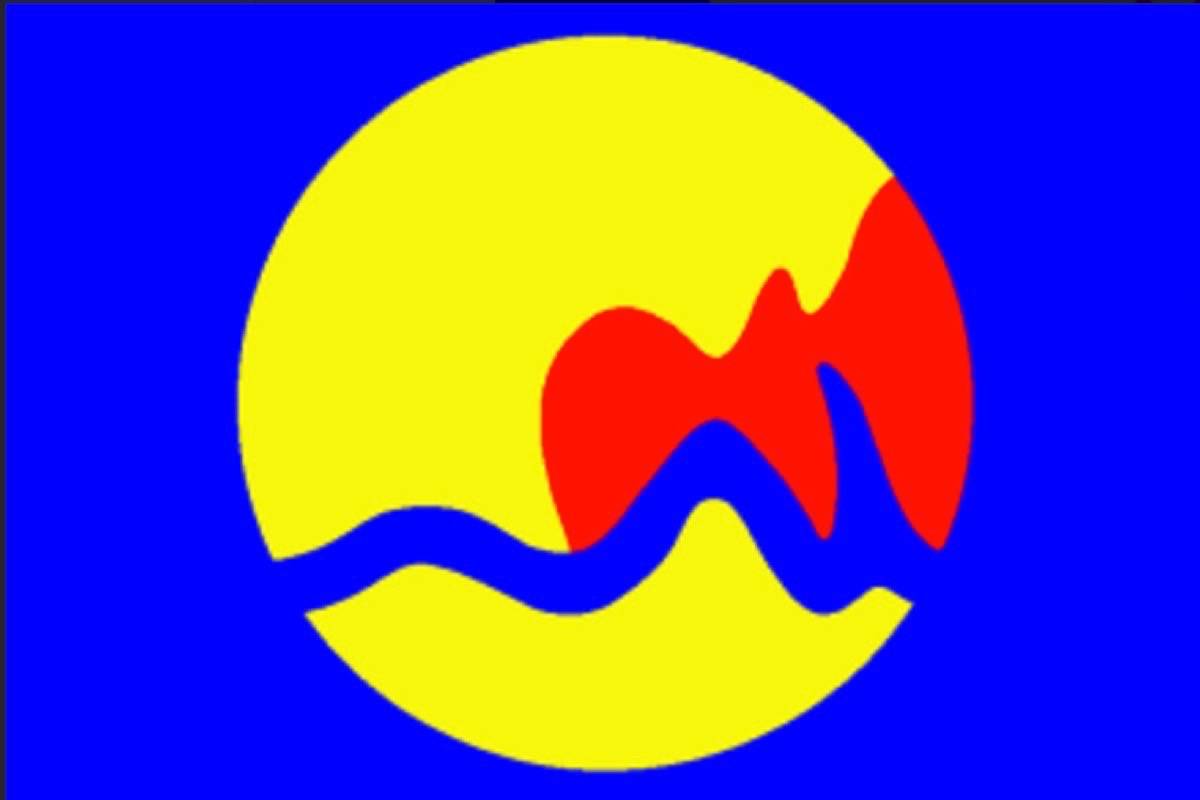
The flag is described as a “banner of the Arms; Coat of arms: Per saltire Or and Gules in chief and in base two salmon, in the flanks two double-bitted axes counterchanged.”
In other words, there are two axes and two salmon on a field of red and yellow.
The axes and salmon obviously refer to the historical importance that forestry and fishing have had in Sooke.
The choice of red and gold are the colours of Spain and hence allude to the first European contact. The gold can also refer to the wealth derived from Sooke’s traditional industries, as well as to the Leech River gold rush.
The diagonal division of the shield makes an allusion to the flag of Scotland and thus to Captain Grant, the first European settler.
And before anyone is inclined to be critical of the flag’s design, it should be noted that municipal flags are inherently problematic.
When Calgary unveiled its flag, several wags in the community questioned whether the municipality had been sponsored by the Arby’s restaurant chain as the cowboy hat on the flag seemed very familiar.
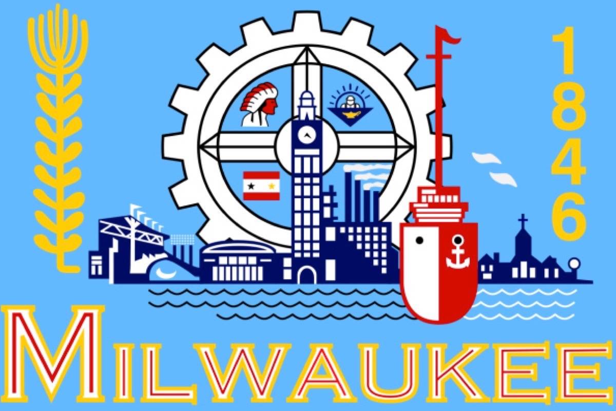
Grand Rapids, Michigan opted for a stylized design that seemed to be channelling memories of the Ms. Pacman game of the 1980s and it could be argued that Milwaukee’s flag was just trying too hard to cram in every image that the flag designers could think of.
ALSO READ: Guidelines on how to fly the Canadian flag
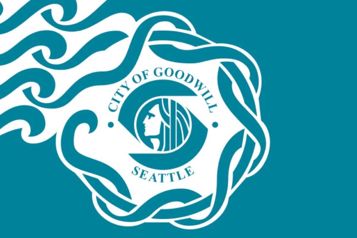
And then there’s Seattle, Wash.
The colours are a little different, but if the wavy lines and design don’t make you think of Starbucks, you just aren’t looking hard enough.
Of course, Seattle was the home of Starbucks so it sort of makes sense, but the flag designers included the phrase City of Goodwill, which just added to the confusion as the City of Seattle might have been more appropriate. They added the word Seattle underneath, just for clarity.
editor@sookenewsmirror.com
Like us on Facebook and follow us on Twitter