Feeling a little hot under the collar? Seeing red? Rather be dead than red?
Clichés aside, it is a warm month in the garden – not solely in temperature but also colour. The harvest is nearing, colours deepening, berries ripening and oranges, rubies, reds and crimsons are now the stars of the border and vase.
Red is a tricky colour for some gardeners – garish? gawdy? – so many reserve it for the “hot border,” a side show to the main event of more conservative cool tones. But red is historically the colour of royalty, opulence, and majesty. Given we are in August, which itself means “grandeur; inspiring reverence” I thought it time to give red its due.
But what really is red? I have only one true red in the garden right now: an heirloom ‘Red Spider’ zinnia that neither leans orange nor purple. Almost all my other reds illicit descriptives: carmine, firecracker, vermillion, cerise…
Why is red so complicated? First of all: we can’t easily see it. No, I don’t mean the colour blind (who are predominantly male), I mean all of us. From a distance red disappears. As Nori and Sandra Pope write in their exceptional gardening book Colour by Design, “at one yard red sings; at three yards, it is still pretty sonorous; at fifty, it is hard to differentiate from dark green shadows.”
Red absorbs most light. And for men (who interestingly have more rods in their eyes than women and thus cannot see subtleties of colour as well women but have a better vision in low light and better depth perception), the qualities of red at a distance can be very hard to discern. So rule one: keep red close.
Think of it this way; we all want to be warmed by a fire.
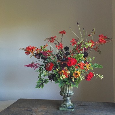
Rule two: it’s more interesting to play across a colour range than it is to juxtapose red with other colours. Picture this: blue Aegeratum, red zinnias, yellow cannas. All primaries, so a punchy combo for sure, but sounds like a traffic island planting, right?
In a home garden, planting across a colour range is more evocative. You might work oranges into scarlet, scarlet to crimsons and crimsons into plums, exploring different tones and shades. I make a lot of bouquets and find the same strategies apply: harmonious designs are often monochromatic. This doesn’t mean simplistic – far from it – rather a range is expressed, so your eye doesn’t jump from colour to colour and instead absorbs colour, shape and texture together – the subtleties of design.
Try incorporating burgundy and coppery foliage to create harmony when using red. For example, the popular dahlia ‘Bishop of Llandalff’ has both darkened leaves and scarlet blooms and the Dianthus barbatus nigrescens group combines rich red blooms with dark foliage. I use the scented geranium Pelargonium quercifolium ‘Chocolate-Mint’ in bold floral designs given it has velvety leaves with a nice “bruising” of purply-brown in the centre of the leaves.
Green is directly across the colour wheel from red which means they are technically complementary colours and thus create vibrancy when used together. But be cautioned: they are opposites.
Seek resonance of foliage and flower by leaning into deeper tones or muted surfaces. ‘Blumex’ and ‘Rococo’ parrot tulips exemplify this idea perfectly: matte sage green leaves, saturated reds, touches of burgundy and orange all bundled into one perfect plant.
P.S. Order them now.
Christin Geall is an avid Oak Bay gardener and a creative non-fiction writing instructor with the University of Victoria.
cultivatedbychristin.com